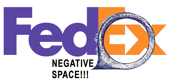
There’s nothing easy about making a negative space logo like FedEx, but here are a few basic steps to launch the project. Working it out can take days if not weeks, but the concepts to create a good negative space logo only requires these 5 easy steps.
Negative space is that area around a graphic which helps to define the boundaries of the positive space while communicating a message or idea.
1. Start with the white space – White spaces are often ignored around logos, but if we take a closer look at the FedEx logo we will see how white space is captured in between the “E” and the “X” to create an arrow pointing rightward. Focus on the white space and decide where you have to build in the negative space icon (see below).
2. Download a font or icon to create the negative space – By building a simple font or icon into the “featured image”, you can create the negative space while having a symbol that is already representative of the message you want to communication. (DOWNLOAD SAMPLE ICON HERE)
Use a sample icon for creating negative space for a place to start.
3. Use basic design discipline to create the “featured image” where the negative space logo will play off – The results of making negative space logos can be brilliant, but they also risk being too clever for their own good. For this reason, you should start with a simple and effective “feature image”. For example, if you are a beer store, use a mug of beer and play off the handle’s negative space.
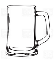
This is the “featured image” where we will take negative space. An open handle is perfect for a font or an icon.
4. View other examples – Where negative space in logos have been successful, including the famous FedEx example, you will find tips and trips for applying your own hand at creating a negative space logo. Design factors that lead to the success of a negative space logo remains basic understanding of graphics and design: symmetry, simplicity, color selection and communication apply to a negative space logo as do any logo. Google “Good Logo Design” or CLICK HERE for some ideas on what makes good design in logos.Examples of negative space logos:
![]()
![]()
![]()
![]()
![]()
![]()
![]()
![]()
![]()


There’s nothing easy about making a negative space logo like FedEx, but here are a few basic steps to launch the project.
5. Apply the icon into the designated negative space – The last step in creating a negative space logo is to drop the icon into the main logo image you are trying to set off. For the sake of this tutorial, see below concept with utilizing a font instead of an icon to create the negative space, with the same outcome.
How to make a logo like FedEx requires knowledge making negative space logos. There are only a few examples of well-designed negative space logos.
-
Negative Space Oddity – A bloggers favorite negative space logos at LogoDesignLove.com
more -
How to Use Negative Space – Some more tips and trips at 1stWebDesigner.com
more -
HP’s Logo Story – The bumpy road one negative space logo took at TheVerge.com
more