There are common web design mistakes companies make which tell customers that communication and support is secondary. They should know better. It’s a dead giveaway when the stock holder, for instance, is given a link when the customer isn’t. That company’s landing page may be responsive with big branding statements, but their anti-social tendencies and communication avoidance is bigger because of a lack of prioritization.
It’s hard to believe these mega companies are making common website design mistakes – putting important information below the fold, for instance – when they spend millions on advertising and public relations campaigns. While these web design mistakes companies make often result from risk aversion (i.e., Legal and Compliance departments won’t allow a company Facebook page, or they clog the flow of company news), a lack of usability on a company’s landing page immediately reveals how much the company really cares about opening their door for customers.
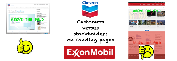
![]() A relevant example of web design mistakes companies make is found when comparing two of the very biggest players in energy – Chevron and ExxonMobile. While these companies are doing a lot of things right on their websites, one of them is communicating – whether true or not – that their priority is with the stockholder first.
A relevant example of web design mistakes companies make is found when comparing two of the very biggest players in energy – Chevron and ExxonMobile. While these companies are doing a lot of things right on their websites, one of them is communicating – whether true or not – that their priority is with the stockholder first.
|
Company Website Landing Page |
Visible Social Links |
Visible Recent News |
Visible Contact Link |
Innovative Design |
Company Stock Ticker |
|
Exxonmobil.com |
NO |
NO |
NO |
YES |
YES |
|
Chevron.com |
YES |
YES |
YES |
NO |
NO |
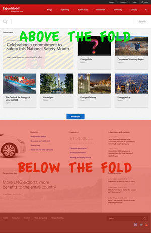 What ExxonMobil has here is a failure to offer readily available communication tools to the average customer. While their design is higher on the awesomeness factor than Chevron’s, their lack of blogging and below-the-fold availability of social media and company contact information keeps the user searching for too long. In fairness to ExxonMobil’s designers, the massive SEARCH box at the top of the page is one of the most utilitarian features we’ve seen, but by placing too many marketing call-out boxes above the fold, they’re telling the customer that making an impression is more important than anything else.
You’ll find many websites gabbing on about how great designs are impacting clients’ impressions. But functionality and utility always trump design where customer service is important. Image is not everything – not when those people are trying to find a solution to a problem by searching for the CONTACT link at the top of the landing page.
Common web design mistakes companies make:
- No visible social media links “above the fold”
It’s hard to understand how big business misses the boat on social media. But they do. Often, these button-down types have LinkedIn accounts but fail to leverage their existing users and those who are following them with this massive social marketing tool. Like it or not, clients expect Twitter, Facebook and even the others like Pinterest. - No recent news “above the fold”
It’s called a blog, but most Fortune 500 businesses still don’t have one on their home pages. The fact of the matter is that investors and customers are much less likely to visit the website unless new information is made available on a daily basis. - No contact link “above the fold”
Most clients are not interested in reading about a company’s high opinion of itself – especially when they’re looking for a quick solution to a problem. Netflix.com gets this mostly correct, for instance, by linking clients to that place where all their problems can be resolved: HELP CENTER. - No slogan describing the business “above the fold”
Unfortunately, not even dow.com associates their logo or places this information above the fold. These executives shouldn’t assume the public – or their potential investors – know what their multi-billion dollar company does simply because sycophants around them do. These are web design mistakes companies make, but that are easy to avoid. - No sales funnel “above the fold”
In the beginning steps for building a website, both big and small, website managers must include a sales funnel for moving new customers into revenue generators. The sales funnel visually carries the user along the sales process from their first visit on the site to the final sale. New customers also appreciate the assistance.
By designing a website landing page with glitz and fabricated nuance, a big company can reinforce their innovative branding; nonetheless, once those first few seconds elapse for the customer the sense of alienation will start to sink in. Design mistakes start with website managers who put too much emphasis on visual attractiveness and not enough focus on knowing what it is their customer needs.
Communication to customers should be the reason for your website, after all.