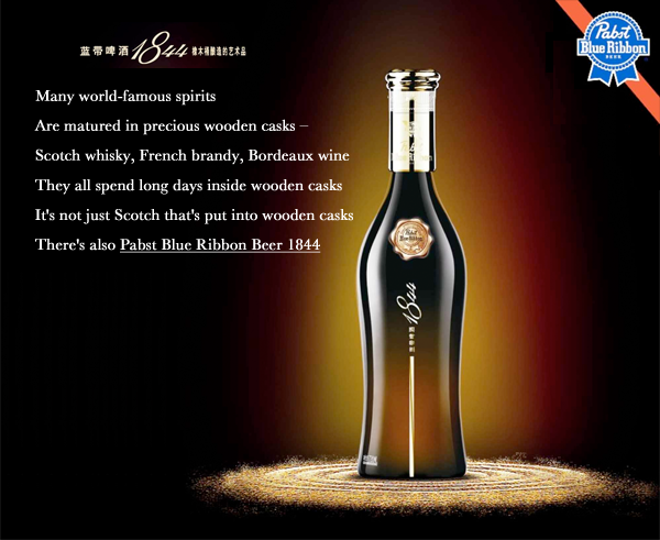
Strategy for rebranding a website should be modeled after the folks convincing Asians to pay $45 for a PBR – fresh design and clever content sells.
At some point most website managers realize a website is dying. Remiss to update content, designs, features or pictures – it’s the rebranding that revives a languishing website. One of the cleverest of rebranding ploys comes from Pabst Blue Ribbon company who rebranded their infamous swill four years ago. Since then, they’ve proved it is about marketing the old name, it is about writing fresh copy explaining why it’s better than the predecessor, and it is about creating a “must-have” for customers.
Consider this new and improved Pabst Blue Ribbon brand, better than the proverbial hipster beer sold at dive bars or wherever America tries to be urban, built on the quality of the beer that in 1893 won a single blue-ribbon in Chicago. It’s the beer we’d buy for our mechanic or for a cousin changing the oil on his Dodge Charger. It’s working class simplicity. PBR is that sincere American lager for blue collar men everywhere.
That paradigm has been flipped in Asia where Pabst Blue Ribbon sells for $45.00 per bottle. If you think your website is old fashioned or passé, it’s time for a rebranding. Rebranding a website that’s languished in years gone can be easily done if you follow PBR’s model. Google rewards domain names registered long ago, after all. Nostalgia in marketing should never be underestimated – nor should fresh new perceptions such as the way PBR has fused their graphics and verbiage using basic strategy that only Big Beer could pull off:
 Tell them how long you’ve had the website
“Built in 1999” means that you’re legit. Websites are trying to build confidence in users by listing their founding date. Similarly, PBR is built on American Grit – by putting a blue-ribbon on their cans (reminiscent of 19th Century greatness), Pabst has assured 20th and 21st century Americans and Asians of its legitimacy.- Tell them you’ve had it tough
What might have passed as great beer in hardscrabble nineteenth century America doesn’t compare to the fine crafted beers we know today. But customers appreciate a long and hard history leading to success. Think Levi’s blue jeans birthed from California’s 1849 gold rush; think Steve Jobs building computers in his garage; and don’t forget the New Coke failure of 1985 that led to the biggest rebranding in consumer history. All great businesses have a hardship story that consumers appreciate when communicated appropriately. Rebranding a website should include those tales of hardship. - Introduce your website to new markets
Consider translation services to put your website on the cutting edge in a new country. The makers of Pabst Blue Ribbon 1844 introduced their ale in the booming Asian market by marketing a sleek design in a high end box. They also created content campaigns celebrating the “German caramel malt (no-rice, all malt) and American cascade hops. Aged in new American oak barrels.” Selling America as a brand can be quite a boon. Consider rebranding a website based on patriotism and origin. - Your website can be great again
Traffic to websites can change as quickly as Google effects changes to its algorithms, so rebranding a website as “Great Again” will keep people talking about how great the tradition is. For PBR, the simplicity of it’s working-class branding peaked in 1977 with production topping 18 million barrels. By 2001 the brand’s sales fell below a million barrels and the company was eventually bought by C. Dean Metropoulos. After falling on hard times, the website has become one of the most sought after brands in beer. In fact, the U.S. Securities and Exchange Commission forced two advertising executives in June 2011 to cease efforts to raise $300 million to buy the Pabst Brewing Company. The two had raised over $200 million by crowdsourcing, collecting pledges via their website, Facebook, and Twitter. - Charge a premium for your services
If your cheap website wasn’t enough to attract clients, try going high-end! Priced at 280.27 China Yuan Renminbi (US$45), the New Yorker‘s Evan Osnos recently remarked about how upscale PBR has become: “Somewhere over the Pacific, Pabst Blue Ribbon began putting on airs.”
Remember, rebranding a website is a bold move meant to revive or defend your customer segment from going elsewhere. So, grab a cold six-pack of PBR and begin rebranding a website – just remember to put it in a nice box and call it sentimental.


