Twitter loses billions due to bad design

On February 5th Twitter announced that slowing sales and disappointing user growth means they need to reconfigure their design and core functionality. Twitter’s chief executive, Dick Costolo, told disappointed stock holders that twitter is desperately working on making its interface easier for users to use. “We will continue to invest in making Twitter a more visually engaging medium,” he said. “It will be a combination of changes introduced over the year that we believe will begin to change the slope of the growth curve.”
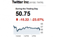
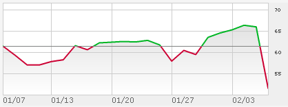
But could bad design really explain the nearly 25% erosion in its stock price? Absolutely. Twitter is facing a slowdown in user growth, admitting that only 3.9% quarterly growth is half what previous quarters experienced. The shocking drop in the company’s valuation could point to a hyperinflated stock price, but New York Times writer Vindu Goel offers that the redesigned feature set available on Twitter has become too difficult to use:
Twitter has finally acknowledged what any newcomer could have told the company within five minutes of signing up: The messaging service is too hard to use. – Vindu Goel
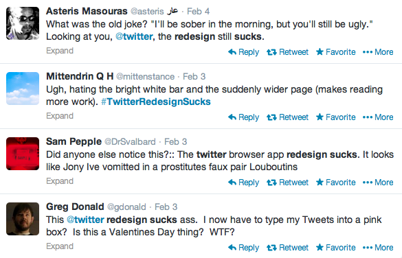
And while webpagesthatsuck.com has yet to add Twitter to their suckiest favorites, there are plenty of users out there who have voiced their opposition to the redesigned pages. While Sophie Murray-Morris called the redesign “cleaner” when it was originally unveiled in January, others have not been so kind. “I’ll be sober in the morning, but you’ll still be ugly,” joked @asteris.
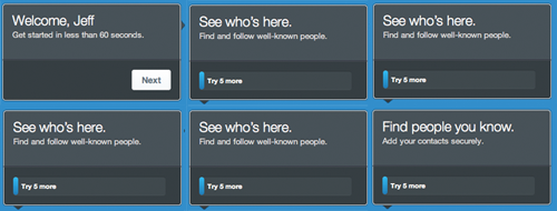
 Of course, change is always difficult, and even as the Twitosphere heckles itself about bright white bars and pink Tweet boxes, the hecklers are using the very medium they are complaining about. It’s like they are yelling at their wives for having ugly children. But for new users accessing the service for the first time, many of them stop midway into the sign-up process, giving up after their 60-second tutorial turns into an exercise in complexity.
Whatever happened to sign me up and go? Philip Pearlman called the signup process “tortuous” and “shockingly bad”.
The sign-up flow prevents new users from getting to the magic of Twitter quickly and easily. Twitter is a place where millions of experts from all over the world are discussing incredible things smartly. On my new account, however, I am following a small handful of random people, including Kim Kardashian, that I would never really want to follow in real life. – Philip Pearlman
While the user interface engineers scratch their head over at Twitter, website managers everywhere could take a simple lesson from it all. Customer testing, customer testing and more customer testing. At least go public with the designs before releasing them, gathering buy-in from a select list of users who can later help defend the improvements. We will all face the client and customer who will complain about the new design being worse, but with a list of improvements next to concrete user testing statistics, the fallout resulting from redesigns can be mitigated.


Thanks for recognizing the importance of good design! It costs this country billions in lost productivity. Good design = happiness!
Watch the stop pop back next week, then what will you say?
Just joined Twitter on iPad… Could not add profile photo… Took an hour to “tweet” and don’t know if it reached @midnight … I’ll bet they have some guru advocating bootstrappy dumb-down minimally-functional MVC razor architecture at Twitter central. Horrible UX!