A blog for Website Managers ...

Dynamic functionality of a website

Dynamic functionality of a website

The dynamic functionality of a website falls into specific categories. Website managers should define which one theirs fits and manage it accordingly. Too often, websites attempt to serve multiple categories, which confuse users. By defining a website within one of these categories, website managers will help search engines respond with better results while offering opportunities for allied websites to back link to their website because they know exactly what to expect.

Big corporations are as guilty as smaller companies in failing to serve specific and dynamic functionality to users of their websites, often presenting a mishmash of hard-to-find portals, outdated news feeds, antiquated customer support sections and pedantic marketing information.

To define the dynamic functionality of a website, a website manager should ask the simple question whether it changes or not. Does the website change or customize itself frequently and automatically? We’re not talking about rotating banners here, mind you! We’re talking about real functionality. For instance, a dynamic website could automatically and continually displays user posts, relevant news, and product updates. But other dynamic functionality is innovative and unique so that the service is the purpose of the website rather than a benefit of a larger agenda they’re presenting.

21 categories for dynamic functionality websites
  • Activity – A place for users to find others with common interests who have planned activities or are interested in creating new events to serve those interests.
  • Affiliate – A third-party website whose purpose is to sell or present someone’s product or service, usually for the purpose of generating advertising revenue.
  • Archive – Searchable data, usually pictures or documents, presenting information that is legally required to be stored or is otherwise valuable to the users.
  • Association -A website where like-minded individuals participate in common interests relating to professions, interests or other personal activities where users are invested.
  • Blog – A website journal used to post online diaries from individuals.
  • Comedy – Where users can trade or find jokes on specific or a variety of topics.
  • Classified ads – A way for users to solicite and search services, usually within a small niche that would otherwise not be available on larger websites like Craigslist.
  • Community – This website allows like-minded individuals to participate in newsgroups or research news and user posts for the common purpose of building interest among its visitors.
  • Company – Providing information about a corporation or business that assists customers and investors in their research.
  • Cult of personality – Imagined or otherwise, this website is usually created by big personalities in entertainment or their fans for the purpose of gossip or self-promotion.
  • Dating – A place for users to find relationships.
  • Gambling – A place to speculate on games or make spreads on arbitrary activities where odds influence the outcome of agreements made between two parties.
  • Investing – Website where research is presented with the opportunity to invest in speculative commodities or instruments that will increase or decrease in value over time, depending on established markets and their influences.
  • News – Exactly what it implies.
  • Personal – Often a family or individual website where blogs, pictures or other posts appear for friends and family.
  • Political – Propaganda site produced to influence perspectives on an individual or cause.
  • Porn – A site where sexually explicit content is presented.
  • Products – Website for selling items, typically in shopping carts.
  • Religious – A place where users can find spiritual and practical inspiration, support and assistance regarding life’s larger issues, often leading to community involvement.
  • Search – A research destination where information is aggregated and presented based on user queries.
  • Social – Networking websites used by individuals to communicate with others who designate shared interests

If the website is not dynamic – stop what you’re doing and add dynamic functionality immediately! Whether it’s daily news feeds presenting unique content, quizzes, ongoing surveys and pole results, or even a web camera displaying video of the warehouse where employees are shipping products to customers, give users a reason to come back for more of something that’s interesting. And remember that it does not have to be useful to be dynamic and interesting.

Dynamic FunctionalityOriginally, websites were informational without dynamic functionality to create “stickiness” for users to come back time and again. But what started out as a U.S. government research vehicle quickly blossomed into a massive network of personal and professional individuals and businesses looking to attract new users to their place in the world.

While the dynamic functionality of a website may cross into many different categories, most website managers will find by narrowing their mission to one, then he or she can research others who fit into that same category, borrowing dynamic functionality and attracting users similarly.


Why a website quiz creator works

Why a website quiz creator works

We might dislike friends who post quiz results on their Facebook statuses, but a website quiz creator can increase traffic to your website. Here’s why – people are motivated by self discovery. And motivated buyers, after all, are exactly who we want visiting our websites.

Quizzes offer test-takers a way to evaluate themselves while avoiding self-serving bias. It’s this thrill of avoiding their own bias that motivates quiz takers to find out something they might not already know about themselves.

Evidence of online quizzes are everywhere, creeping into our news feeds and displaying where we least expect them. From answering questions about whether you are in love to finding out whether to quit a job – website quizzes purport to solve the big problems. At other times, the novelty factor of knowing What State Am I can provide anecdotal evidence to us that our national identity is (or is not) what we think.

Website QuizWebsite managers know it’s better to build websites that go beyond basic web pages. Here we summarize the two methods to assist in building a website quiz and the four psychological formulas for targeting the emotions of test-takers:

Two Methods for Creating a Website Quiz

  • Algorithmic Website Quiz – Includes variables fed into the quiz from external data, including indices such as financial markets or other factors which change on a regular basis. These quizzes may report one thing one day, and entirely something different the next. Unfortunately, this type quiz cannot be developed using a “turn-key” website quiz creator and usually needs special development and API integration.
  • Static Website Quiz – Most of these static website quizzes are created in just a few minutes, but can become viral in almost the same amount of time it takes to create them. Website managers can create them easily using simple forms on the following websites:
    • onlinequizcreator.com
    • freeonlinesurveys.com/free-online-quiz
    • quizbean.com
    • makeaquiz.net
    • zoho.com/survey
    • quizdini.com
    • imagequiz.co.uk
    • socrative.com
    • infuselearning.com
    • articulate.com/products/quizmaker.php

Four Psychological Reasons People Take a Website Quiz

  • Confidence Building Quiz – Past achievements in activities help to nurture the ego. People like website tests to reflect knowledge on specific subjects – or even better, subjects that are whimsical while being subjective. A Wine Challenge quiz might allow the aspiring sommelier to build confidence for taking that next step toward a test-taker’s life-long dream to quit his or her job and become a wine expert. A Confidence Building Quiz allows the website quiz creator to capture those who might find your website a voice of authority or – at least – a destination where smart people demonstrate how much they know.
  • Vicarious Experience Quiz – These website quiz takers need to feel more experiences in lives. Many want to escape back to those experiences when they were younger, or what they aspire to be when they get older. Consider the What Country in the World Best Fits Your Personality quiz, and you’ll be able to dream about your next vacation while also demonstrating to friends that, in fact, you should be living in Tuscany, Italy instead of Union, New Jersey.
  • Emotional Arousal Quiz – Control over emotions can be the most difficult task in life. In fact, most people like to explore their emotions by testing themselves with new challenges and adventures. The What Type of Car Would You Be quiz asks questions about your personality while baiting you with the idea that you can be something bigger than you really are.
  • Life Goals Quiz – We all grew up learning to set goals and set a path toward in attaining them. Goals are what we use to dream and achieve in relationships and business, and goals are what motivate us day in and day out. Not surprisingly, we all fail to achieve all our goals, and here’s where the Life Goals quiz comes into play. For instance, the What Job Should You Have quiz can provide users with a quick and simple affirmation that a life goal is on tract or far away. Relationship and love quizzes do the same with relationships.

Whichever website quiz creator used, website managers are trying to seduce new users into visiting their websites by appealing to emotions. People thrive on a challenge and are interested to know quick results based on these packaged quizzes.

By focusing on which method a website manager wants to use, and how elaborate the quiz needs to be, that manager can inspire a flood of new traffic from test-takers who will likely stick around to see what the website is all about.

A website quiz creator can help bring this new traffic. While it’s just another tool website managers can use when building a website, it can be an effective one.

Web design mistakes companies make

Web design mistakes companies make

There are common web design mistakes companies make which tell customers that communication and support is secondary. They should know better. It’s a dead giveaway when the stock holder, for instance, is given a link when the customer isn’t. That company’s landing page may be responsive with big branding statements, but their anti-social tendencies and communication avoidance is bigger because of a lack of prioritization.

It’s hard to believe these mega companies are making common website design mistakes – putting important information below the fold, for instance – when they spend millions on advertising and public relations campaigns. While these web design mistakes companies make often result from risk aversion (i.e., Legal and Compliance departments won’t allow a company Facebook page, or they clog the flow of company news), a lack of usability on a company’s landing page immediately reveals how much the company really cares about opening their door for customers.

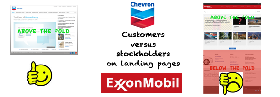
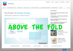
chevron website goodA relevant example of web design mistakes companies make is found when comparing two of the very biggest players in energy – Chevron and ExxonMobile. While these companies are doing a lot of things right on their websites, one of them is communicating – whether true or not – that their priority is with the stockholder first.


Company Website Landing Page

Visible Social Links

Visible Recent News

Visible Contact Link

Innovative Design

Company Stock Ticker

Exxonmobil.com

NO

NO

NO

YES

YES

Chevron.com

YES

YES

YES

NO

NO


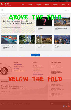
ExxonMobil website badWhat ExxonMobil has here is a failure to offer readily available communication tools to the average customer. While their design is higher on the awesomeness factor than Chevron’s, their lack of blogging and below-the-fold availability of social media and company contact information keeps the user searching for too long. In fairness to ExxonMobil’s designers, the massive SEARCH box at the top of the page is one of the most utilitarian features we’ve seen, but by placing too many marketing call-out boxes above the fold, they’re telling the customer that making an impression is more important than anything else.

You’ll find many websites gabbing on about how great designs are impacting clients’ impressions. But functionality and utility always trump design where customer service is important. Image is not everything – not when those people are trying to find a solution to a problem by searching for the CONTACT link at the top of the landing page.

Common web design mistakes companies make:

  • No visible social media links “above the fold”
    It’s hard to understand how big business misses the boat on social media. But they do. Often, these button-down types have LinkedIn accounts but fail to leverage their existing users and those who are following them with this massive social marketing tool. Like it or not, clients expect Twitter, Facebook and even the others like Pinterest.
  • No recent news  “above the fold”
    It’s called a blog, but most Fortune 500 businesses still don’t have one on their home pages. The fact of the matter is that investors and customers are much less likely to visit the website unless new information is made available on a daily basis.
  • No contact link “above the fold”
    Most clients are not interested in reading about a company’s high opinion of itself – especially when they’re looking for a quick solution to a problem. Netflix.com gets this mostly correct, for instance, by linking clients to that place where all their problems can be resolved: HELP CENTER.
  • No slogan describing the business “above the fold”
    Unfortunately, not even dow.com associates their logo or places this information above the fold. These executives shouldn’t assume the public – or their potential investors – know what their multi-billion dollar company does simply because sycophants around them do. These are web design mistakes companies make, but that are easy to avoid.
  • No sales funnel “above the fold”
    In the beginning steps for building a website, both big and small, website managers must include a sales funnel for moving new customers into revenue generators. The sales funnel visually carries the user along the sales process from their first visit on the site to the final sale. New customers also appreciate the assistance.

By designing a website landing page with glitz and fabricated nuance, a big company can reinforce their innovative branding; nonetheless, once those first few seconds elapse for the customer the sense of alienation will start to sink in. Design mistakes start with website managers who put too much emphasis on visual attractiveness and not enough focus on knowing what it is their customer needs.

Communication to customers should be the reason for your website, after all.

Schedule content before anything else

Schedule content before anything else

Let’s update the procedures for building a website. Before considering the site architecture or web graphics, schedule content before anything else. We all know by now that having a website is not enough, and one thing many website managers have in common is that they forget that blog and content writers should be required to wear many hats. It’s no longer enough to send an email with a document attached.

Direct writers to post content “off page”
First, let’s tell it like it is – your content is more effective when it’s “off page.” Your customers come to your website because they need answers to a problem or want to contact someone to help them with an issue. They don’t want to read boasts about your company. Therefore, consider content on your website the window dressing that gets in the way of what they need. Unless your website is updated on an hourly basis or you are offering some other real-time service or product through it, users are ignoring your news feeds altogether. Instead of putting content above the fold, put contact information above the fold and relevant troubleshooting solutions. Most customers want answers from your website, not thought leadership. When you do put content on it, make sure it’s focused on solutions and value pertaining to existing services. This strategy is often more successful for funneling customers because it has context on your products.

Direct writers to post on multiple venues
Because a website is the auxiliary to an overall portfolio of managed digital services that support an overall media strategy, a good website manager funnels customers to a website from those “off page” resources they’ve negotiated. To schedule content before anything else means to find those resources and make sure the writers post to them. These resources include the following:

  • Customer feedback venues
  • Social media communities
  • Conference and Trade Show networks
  • Award and competition initiatives
  • Allied partners
  • Traditional news media

Have writers contribute using social media tools
The argument for posting to multiple venues is further supported by the ease with which writers can post to these outlets already familiar to them. The price of content writing reflects the ease. Website managers should put less emphasis on posting to their own websites and more emphasis on getting writers to contribute to those digital venues outside the company, especially LinkedIn and Facebook. A hired writer needs no special training posting to Facebook where a custom Joomla or complicated Word Press integration implies higher fees for the contributors.

Negotiate writers to create email “Newsletter” digests
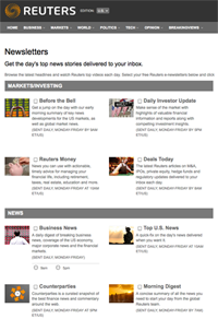
Somewhere along the way marketers decided sending emails to customers and subscribers was a waste of time. reuters-news-digestIn reality, news digests that aggregate information is making a comeback. Check out Reuters.com‘s free news aggregation service that lets subscribers specify what headlines show up in their inbox. By hiring writers to create newsletters, you can pluck stories from them while maintaining a fresh and periodic media outlet that your customers will appreciate.
Pricing should be negotiated on an hourly basis
For far too long, website managers have considered a static word count the guidepost for paying writers. Because a picture is worth a thousand words and videos much more, the price of content writing should be based on time and quality, not quantity. Consider using oDesk or Elance online outsourcing venues which offer hourly tracking software to monitor contractors’ time on projects.

Buy in bulk when negotiating the price of content writing 
Contracting content in bulk allows website managers to schedule postings throughout the year, with designated posting times that are friendly to Google algorithms because it demonstrates freshness, originality and organization. It also saves website managers money. Contracting content should be for daily, weekly or monthly posts – ignore any advice suggesting there could be a one-time price paid for parking content on a website. (Google ignores websites with old news displayed prominently.)

Where five years ago it was enough to have a website, today’s successful marketing professionals know the elements to successful digital marketing derive from the division of off page referencing, including sourcing information from emails they receive on a daily, weekly or monthly basis. To schedule content before anything else means hiring writers based on these aspects.

Auto Scaling your bandwidth limits

Auto Scaling your bandwidth limits

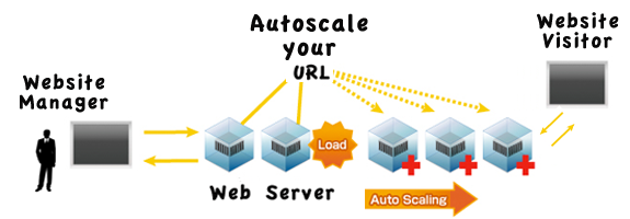
The definition of auto scaling is when the web server automatically scales due to spikes in web traffic. Nodes are added and subtracted like a rubber band. A feature offered only from the most reputable web hosting companies, automated parameters trigger increases when needed, automatically adding more nodes when physical demands are required on the web server.

Server hosts don’t like it when website managers use auto scaling to avoid reaching a site bandwidth limit. They don’t like it because with preset triggers there is no need to contract additional server hosting space that will go unused most of the time. By auto scaling your bandwidth limits, spikes are covered at a huge savings because you only pay for the spike. Billing changes proportionally with the instance of auto scaling, but paying for occasional usage is better than paying every month for capacity you don’t need.

Website managers make the mistake time and time again. First, they rebrand a client’s website into something beautiful and useful, but frugality gets them in trouble because they choose a hosting option that doesn’t allow for scalability in regard to pipe limits.

Only a few hosting companies offer it, including Amazon and Rackspace. Others will try to sell you on a dedicated server costing hundreds of dollars per month. But you don’t need to spend a lot to auto scale your site bandwidth limit. Avoiding the dreaded Bandwidth Limit Reached for this Site does not require buying extra capacity that you don’t need. Instead, auto scale your site bandwidth limit by insisting your hosting company provide the technology to do it. Or find a hosting company that does.

Auto Scaling for WebsitesThere are many aspects to consider when choosing a hosting provider. But the biggest problem a website manager is likely to encounter – especially on shared hosting plans – is bandwidth limits caused by too little RAM. Most shared services allow a maximum 1 GB RAM at any one time, which means there’s no way to scale the traffic when a post suddenly goes viral. That means when your website gets more than 10,000 users at any one moment, users will start receiving errors.

Auto Scaling is the first – and perhaps most important – dynamic to look at when choosing your hosting service. But other aspects do matter.

  • Site Bandwidth Avoidance System – Remember that the website manager is the captain of the ship, so contracting a web hosting service that provides auto scaling is the first step. Once contracted, the website manager monitors the controls and sets autopilot, but he or she also needs to check in regularly to make sure the settings are correct for the site bandwidth limit avoidance system. A hired technician to manage the website’s server shouldn’t require more than a few hours per month. Check the logs and ensure the proper auto scaling parameters are in place.
  • Server Location Matters – The server datacenter location should be within 100 miles of your primary place of business with redundancy spread out. Most reputable auto scale website servers will have multiple datacenters across the continent. For instance, if your client is located in Greenville, South Carolina, you could shoot for a datacenter in Atlanta, Georgia, less than 150 miles away. Make sure there’s redundancy in other big cities like New York City; Washington, DC; Chicago, IL; Dallas, Texas; Los Angeles, San Francisco and Salt Lake City, Utah.
  • Network Transfer is also important – Users might have up to 3 terabytes of transfer assigned for a given month, but a viral post will exceed this limit in a matter of hours if you don’t have auto scale technology activated for transfer limits as well as for load balancing. A proactively managed hosting service has built-in technology that monitors the CPU and RAM resources and monthly bandwidth. The more traffic required, the more physical resources will be dedicated to the system – automatically.
  • No Shared Services – While those discount hosting services are tempting, shared hosting services will inevitably create problems when a website grows, usually because these services don’t offer auto scaling technology. Auto Scaling services are included in monthly plans costing less than $150/month, a price that will pay off in spades when your website goes viral.

If you plan in advance to use auto scaling for managing your site bandwidth limits, servers will upgrade automatically during times of intense traffic on a website. Should traffic on the website exceed expected levels, auto scaling responds with additional bandwidth to cover traffic.

By continuing to use the site, you agree to the use of cookies. more information

The cookie settings on this website are set to "allow cookies" to give you the best browsing experience possible. If you continue to use this website without changing your cookie settings or you click "Accept" below then you are consenting to this.

Close